 Color has the ability to affect our mood, actions, and thoughts of brands and businesses – so it’s no wonder it’s one of the most important aspects of designing commercial spaces. Here at Planning Interiors, we consider ourselves color experts and love the endless possibilities that different hues can bring to an area. Whether you’re looking to increase your employees’ productivity or to encourage customers to purchase more, we have the color psychology tips to help you maximize your use of color in commercial interior design.
Mood
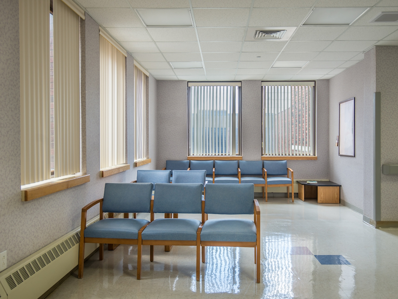
The type of commercial space or business you have can greatly affect the color scheme you use. It’s important to think about what type of emotion or mood you are trying to get your customers to feel. For example, when you walk into a doctor’s office or healthcare facility, more often than not, the main colors used are light blues and greens. This is because, in a usually stressful or unpleasant environment, they can promote feelings of calm and relaxation. On the other hand, if your business depends on stimulating energy and excitement, using reds, oranges, and yellows is the best way to achieve these emotions. Think fitness studios or gyms.

Actions and Interactions
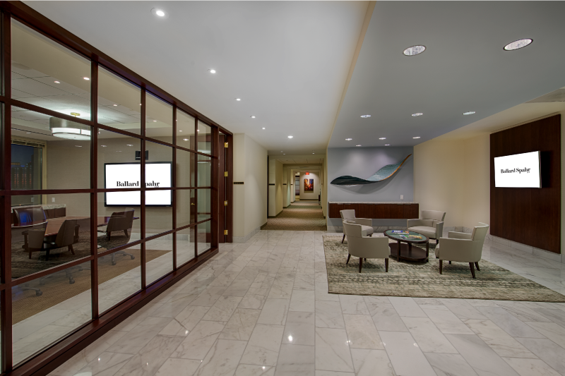
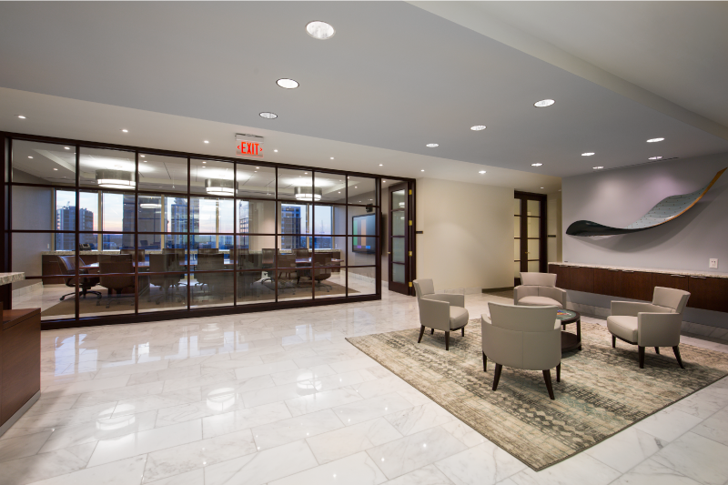
Color can also be used to influence consumers to take certain actions or interact with others in a specific way. For example, if your goal is to get customers to buy more items while shopping, warm reds and yellows are a good way to promote purchasing. They tend to put people in enjoyable and good moods making them more likely to spend more. On the opposite side of the spectrum, purples matched with dark neutrals encourage relaxation and give a more luxurious and sophisticated feel to a space. This scheme is mostly used in high-end spas, restaurants, and nightclubs to add an underlying implication of wealth.

Perception
Color can largely affect people’s perceptions and thoughts about a brand or business. This is not only important to keep in mind when choosing a color scheme for the interior of your space, but also when deciding on a logo. Both are representations of your brand and even something as simple as color can cause customers to make snap judgements and ultimately decide if they want to give you their business. One example of this is that people often associate the color orange with cheapness or value. Home Depot, most prevalently, capitalizes on this perception by combining their very orange logo with cost-effective home improvement goods. Conversely, the use of neutrals or black and whites in a space, gives off a clean, modern, and high-end aesthetic. Apple has the most prevalent example of this application, utilizing a fresh, all-white palate.

The use of color in commercial interior design is extremely important when it comes to influencing customers and employees. Understanding the different effects of color and utilizing a defined color scheme will make your business stand out from the rest. Contact Planning Interiors at 470.545.4906 to get the most out of your space’s design.