Whether you’re designing a cozy residential living room or a sleek commercial office, understanding and using texture correctly can make a space really come alive. At Planning Interiors, we work with textures a lot in our day-to-day, whether we’re working on residential or commercial spaces. Over the last decade, we’ve gained ample experience in working with different textures first-hand. Below, we’ve compiled everything you need to know about texture: what it is, its impact, and how to use it so your space can feel balanced, complete, and gorgeous.
So, What Does “Texture” in Interior Design Mean?
Texture is exactly what first pops to mind when you think of the word in the first place. It refers to the surface quality of materials—whether smooth, rough, soft, or hard. But in interior design, it’s a bit deeper than that. Texture can be tactile, physically felt underhand, or visual, where texture is perceived through sight. When used correctly with different textural materials (as well as the light and color palette of a space), it’s a great way to add depth, interest, and contrast to a room.
Texture in Residential Spaces
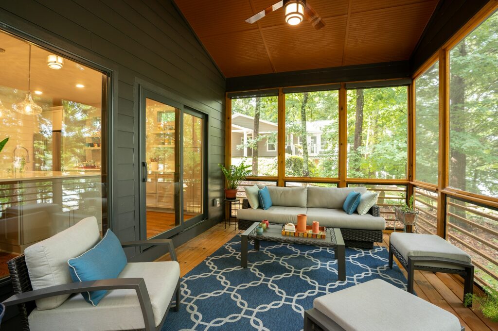
In residential spaces, texture plays a major role in creating your ideal ambiance. For many homeowners, comfort, warmth, and aesthetics are top-of-mind. Soft textures like plush rugs, velvet upholstery, and layered textiles can make a home feel cozy and inviting. On the other hand, harder textures like metal, glass, or polished wood can add a touch of modernity and sophistication.
For instance, in a living room, incorporating different textures—such as a woolen throw over a leather couch or a textured wallpaper behind a sleek wooden console—can create visual interest and make the space feel more lived-in and comfortable. Texture can even define different areas in an open-concept space, providing subtle boundaries without the need for walls.
Texture in Commercial Spaces
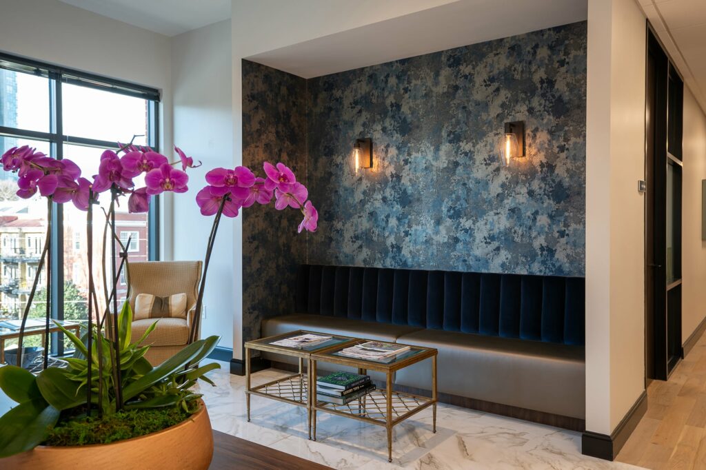
When it comes to commercial design, texture isn’t just about aesthetics—it’s about storytelling. Every texture you incorporate into your commercial space sends a message about your brand. Whether it’s the smooth finish of a reception desk that speaks to professionalism or the textured wall art that conveys creativity, texture helps create a cohesive narrative.
For example, a wellness spa may use natural textures like stone, wood, and linen to evoke a sense of tranquility and connection with nature. A high-end fashion boutique, on the other hand, might incorporate sleek metals, polished surfaces, and luxurious fabrics to create an air of exclusivity and style.
By carefully selecting and combining textures, brands can create spaces that not only look great but also resonate with their values and appeal to their target audience.
Common Textures and How to Use Them
Upholstery
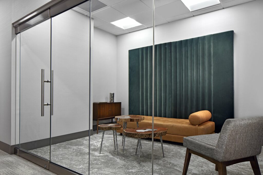
Upholstery is found in pretty much every kind of space you can think of, and it certainly holds a purpose. In homes, upholstered furniture like sofas, chairs, and ottomans are central to cementing comfort and style. The texture of upholstery can vary widely, from the smoothness of leather to the rich feel of chenille, or luxurious velvet.
In commercial spaces, upholstery is often chosen for both comfort and durability. For example, an upscale restaurant might opt for plush velvet seating to create a sense of luxury, while a busy office may choose leather or performance fabrics that are easy to clean and maintain.
Tiles
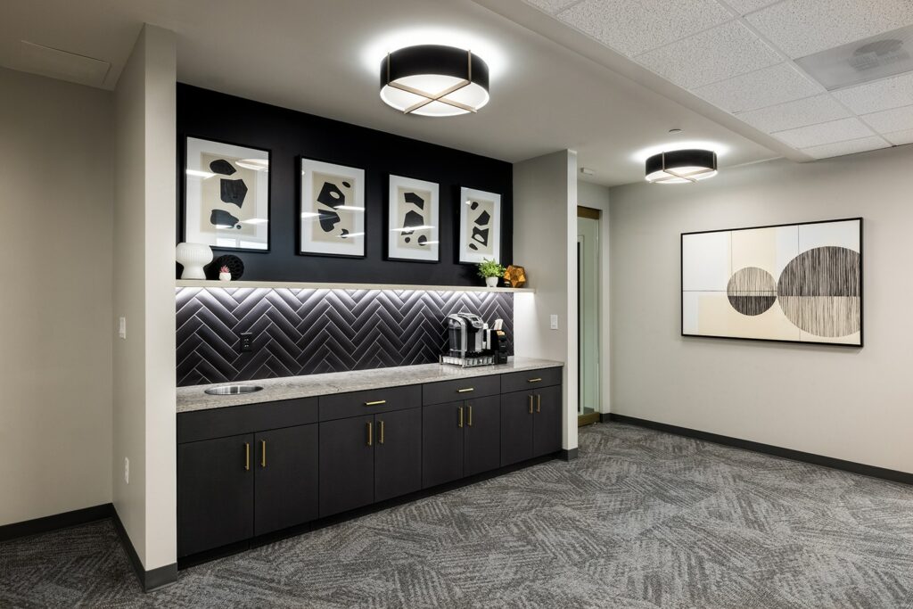
Tiles are a staple in both residential and commercial interiors, and for good reason. In residential settings, tiles are commonly used in kitchens and bathrooms, where their durability and ease of cleaning make them an easy favorite. Textured tiles, such as those with a matte finish or a patterned surface, can add a zing of personality and depth to these spaces.
In commercial interiors, tiles can make a bold statement. For instance, large-format tiles with a textured surface can create a striking feature wall in a lobby or reception area. The choice of tile texture—whether it’s the cool smoothness of marble, the rustic feel of terracotta, or the intricate patterns of encaustic tiles—can significantly impact the overall aesthetic and feel of a space.
Wall Coverings
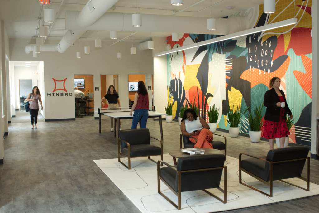
Wall coverings, from wallpaper to wood paneling, are powerful tools for adding texture to a space. In residential design, textured wall coverings can create a focal point in a room, adding depth and character. A grass cloth wallpaper, for example, adds an organic, natural feel, while a metallic wallpaper can bring a touch of glitz and glamour.
In commercial spaces, wall coverings are often used to reinforce a brand’s identity. A textured wall behind a reception desk might feature a subtle pattern that echoes the brand’s logo, or a feature wall in a restaurant might use reclaimed wood to create a rustic, welcoming atmosphere. The texture of wall coverings can be used to enhance the overall design narrative and create a memorable experience for clients and customers.
How to Get Texture Right in Your Next Design Project
Here are a few tips to ensure you nail texture in your next interior design project:
- Consider the space’s function: In residential spaces, focus on your main goal for your space. Do you want to create comfort and coziness? Maybe you want to create a serene, clean, and modern vibe in your home (think Kim K’s infamous, ultra-modern home). Make sure you know the kind of vibe you want to create before even thinking of texture. This same concept applies with commercial spaces, too. Think about your brand’s personality and the function of your space before diving into the nitty gritty design elements like texture.
- Layers, layers, layers: Don’t be afraid to layer textures—combine soft and hard, smooth and rough to instantly create depth and interest.
- Pay attention to scale: Larger textures, like chunky knits or bold wall patterns, work well in large spaces. In smaller spaces, opt for finer textures to avoid overwhelming the room.
- Balance it out: We’ve said it before, and we’ll say it again–texture only works well if it’s done right, and a big part of getting it right is making sure it works in tandem with the other elements in your space. It can be very possible to go overboard with textures if you aren’t careful. Too much texture can make your space feel chaotic, while too little can make it feel flat. Find the right balance so your space feels just right.
Work with Atlanta’s Top Interior Designers to Amp Up the Texture in Your Space
There’s no two ways about it – the right implementation of texture can make all the difference in a space. Our team at Planning Interiors prides itself on using texture as well as a myriad of other elements—from color to light and everything in between– to really bring out the character and unique energy in every project we work on. Reach out to us here if you’re looking to bring out the best in your business or residential space.